 |
| Applying ink to plexiglass |
This work came from a fun evening spent with one of my best friends - Jennifer Schreer. We love to spend creative time together so... for Christmas I signed us both up for a class at the Ann Arbor Art Center. This class was part of a new series they're running this year - The Creative Social Club. They run a different class on the first Friday evening of each month and do a different art project at each one with wine (and pop) included. This month's project was monotype prints... which, even with two art degrees between us, neither one of us had done before. A new adventure shared with a friend is always fun!! This type of print involves applying ink to a smooth surface, we used panes of plexiglass, and then removing the ink to create your design. Unlike standard block printing, which involves carving your design into a surface and then inking it to create your pattern. So, we were giving a plexiglass piece with some ink on it, we rolled the ink evenly across it and then removed ink to create a "design". To remove the ink we used q-tips, toothpicks and paper towels, each removing different amounts of ink and creating a different effect.
The first design we did - the instructor called a "15 minute print"... and for any of you who know Jen and I... we literally laughed out loud at the prospect. LOL!!! We have spent a whole day - literally - at a paint your own ceramics studio because it takes us that long to decide what we want to do and then get just the right design. So, to say the least - we were both challenged by the first project. I decided to keep it somewhat simple and just do a "squiggle" design which turned out pretty good.
 |
| 15 minute print |

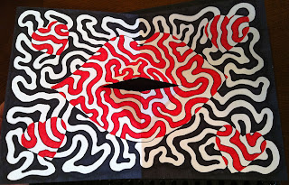
 Once we completed the first one we were sort of set loose to create new designs and be creative with the tools available. So I again went with the squiggles - SURPRISE! :-) This one took a little more time, for me it took the rest of the class. I used toothpicks to draw/remove ink to create the design using the reverse design idea where half of the line is the positive space and on the other half of the design the line is the negative space. I did get the whole thing done in the nick of time - which was stressful. And then it got even more stressful - although I finished the design and was pretty happy with it... the print itself was not what I expected or hoped for in the end. After all that time and racing the clock - it was an emotional disappointment. I of course understand the creative process is often filled with trial and error which can be positive and negative but as a perfectionist... that error and negative can also be emotional and frustrating. So, after the first print not being terribly successful - I made some adjustments/changes to the design and made a second print and then a third. the second and third were better even though they were not the intended effect I was hoping for in the end. I my have to go back and add some color to the original designs of the first print which should add some additional vibrance and fun.
This truly was a great experience! One because I shared it with a friend but two because it was something new. I'm not completely discouraged by this experience - as I would like to try again at home which, for a small investment, I can create a large variety of prints.
Who knows what's to come!


